Paint the town yellow.
BurJuman is the region's only dedicated ‘fashion mall’ and is ultimately the most adept at offering the best choice and most discerning advice to the UAE, GCC and regional style conscious consumer.
BurJuman is perceived as a leader scoring high on the following brand attributes: Trendy, daring and upper class.
BurJuman’s mission in the past has always been to introduce and offer their shoppers premium shopping in a relaxing and accessible environment. Now in keeping with the world wide trend, the concept of shopping malls is quickly being replaced by the concept of lifestyle centers. Hence, the BurJuman expansion project was undertaken to augment the ‘BurJuman Experience’.
The new BurJuman business card.
To complete the move from ‘a better class of shopping’ to a ‘total destination’ the new BurJuman had doubled the shopping area, featuring the world’s top most fashion brands. Therefore the need to communicate a bigger and better NEW BurJuman.
One of the teaser ads that's part of the Kenny Campaign released prior to the relaunch of the NEW BurJuman.
First phase - The Rebranding
Being a massive re-launch of the mall, my work started with rejuvenating the old identity system. The old logo below looks dated. A brand new mall needs a brand new logo.
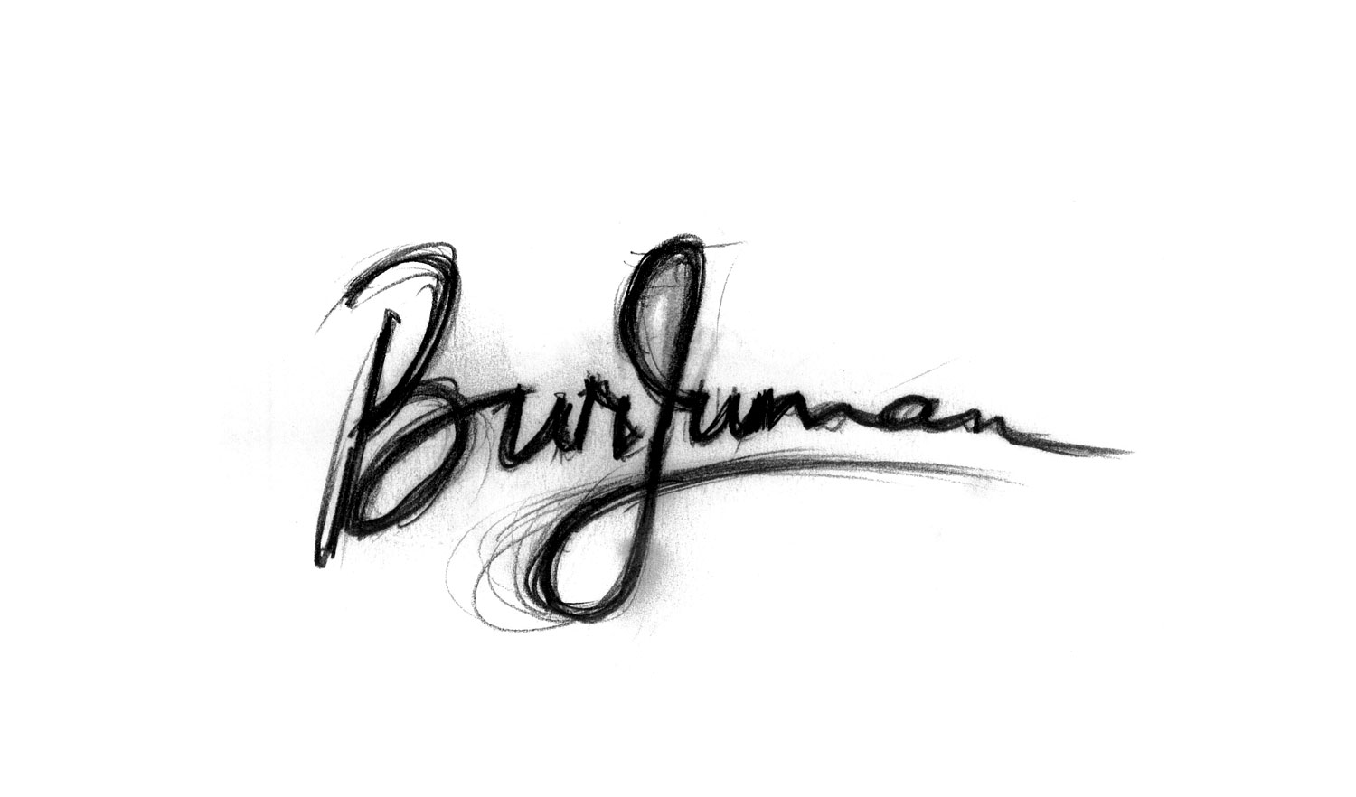
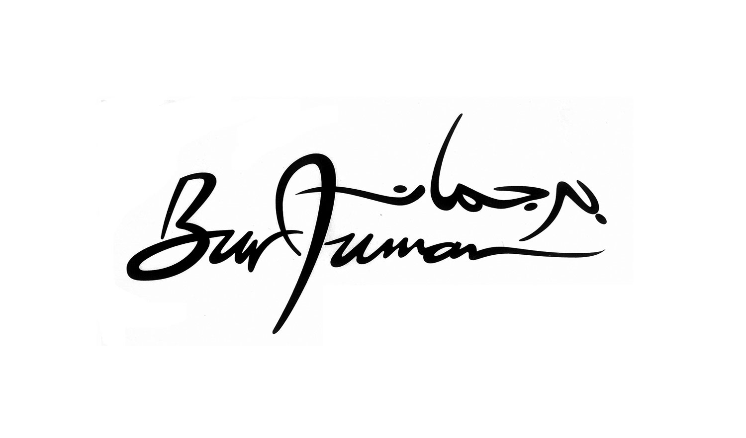
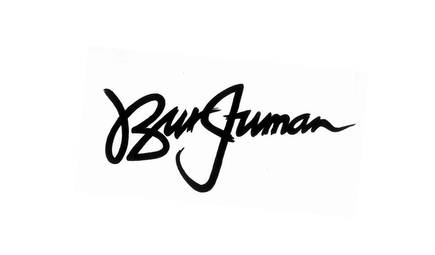
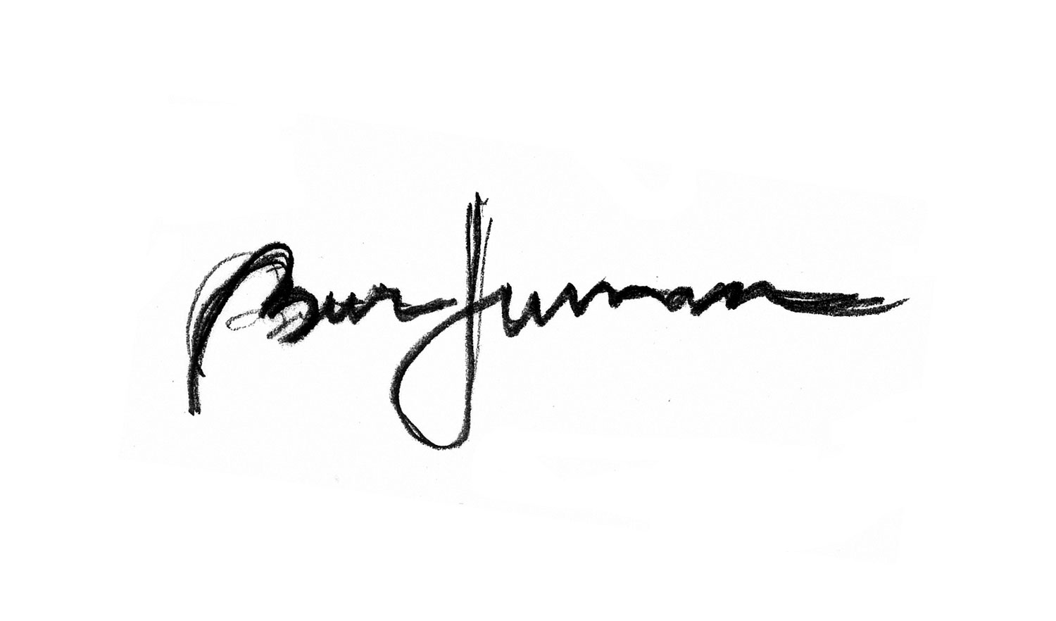
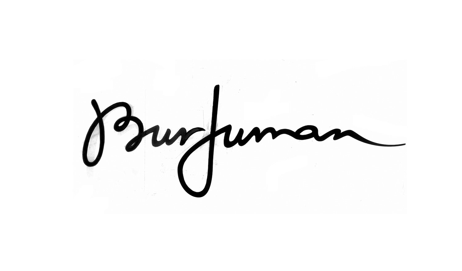
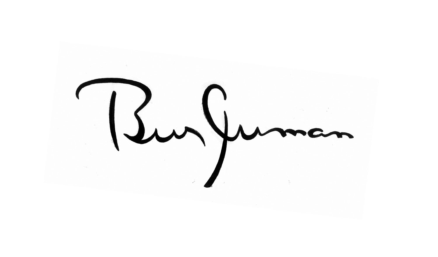
Being almost exclusively catering to women, my initial studies of the brand mark took inspiration from identities of fashion houses. With the new BurJuman housing flag ship brands like Saks Fifth Avenue, it was only fitting to create an identity that would best represent the brands it will carry. It needed a new signature logo much like a fashion house.
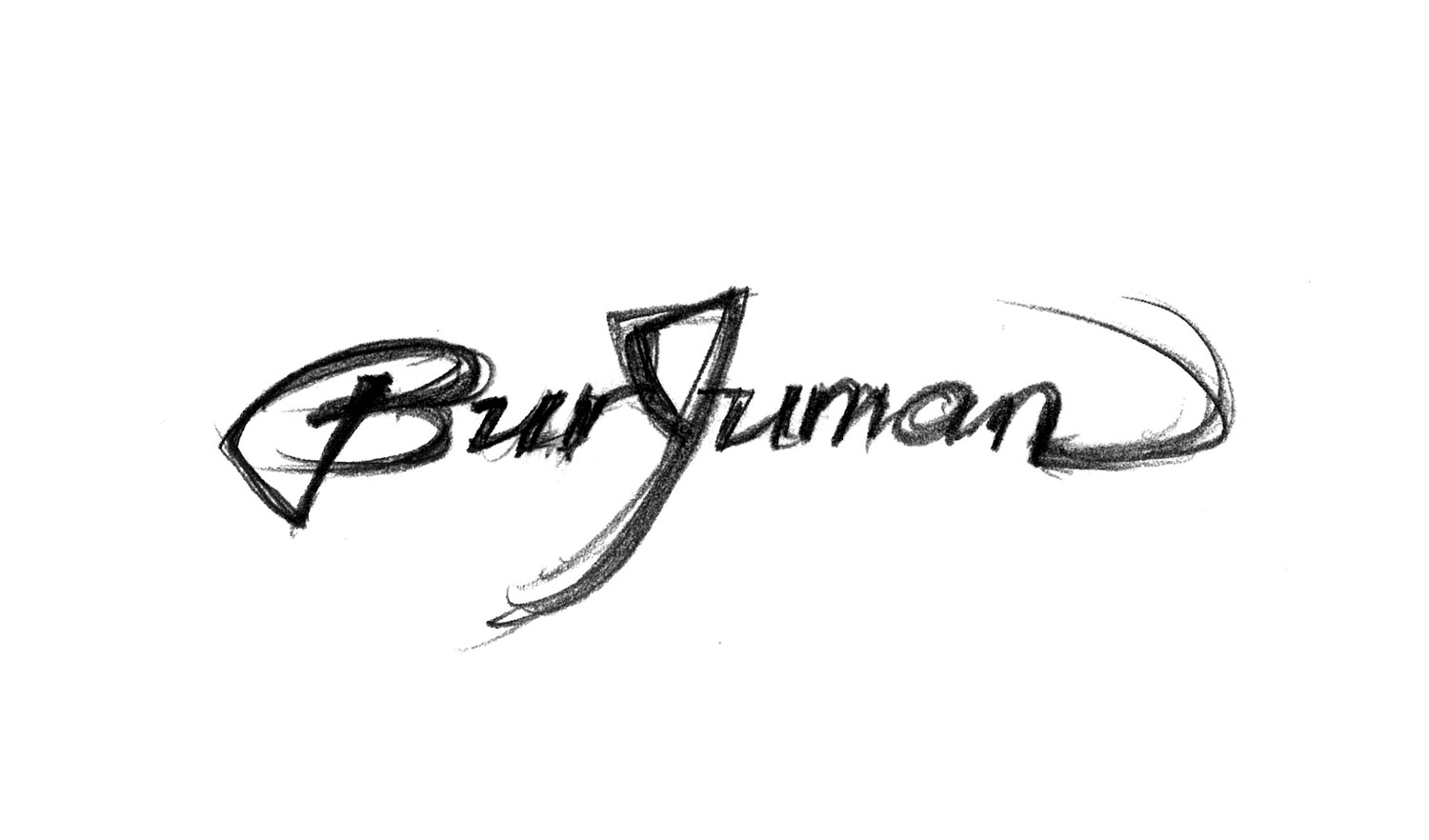
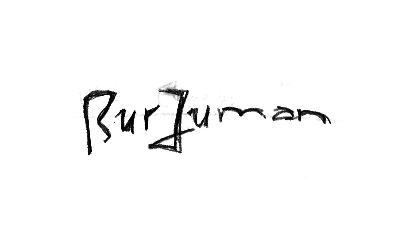
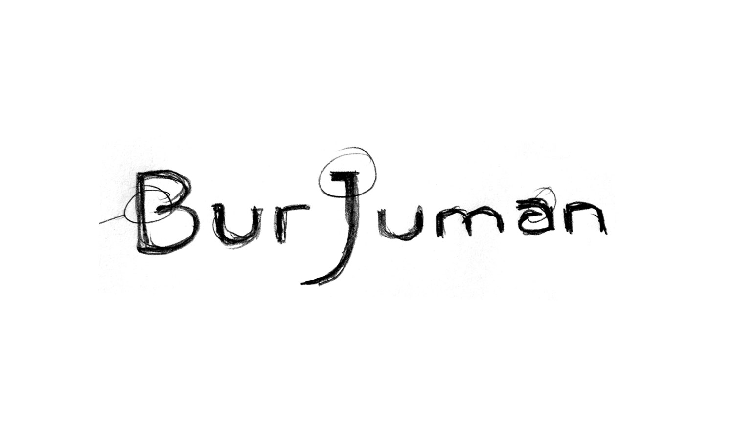
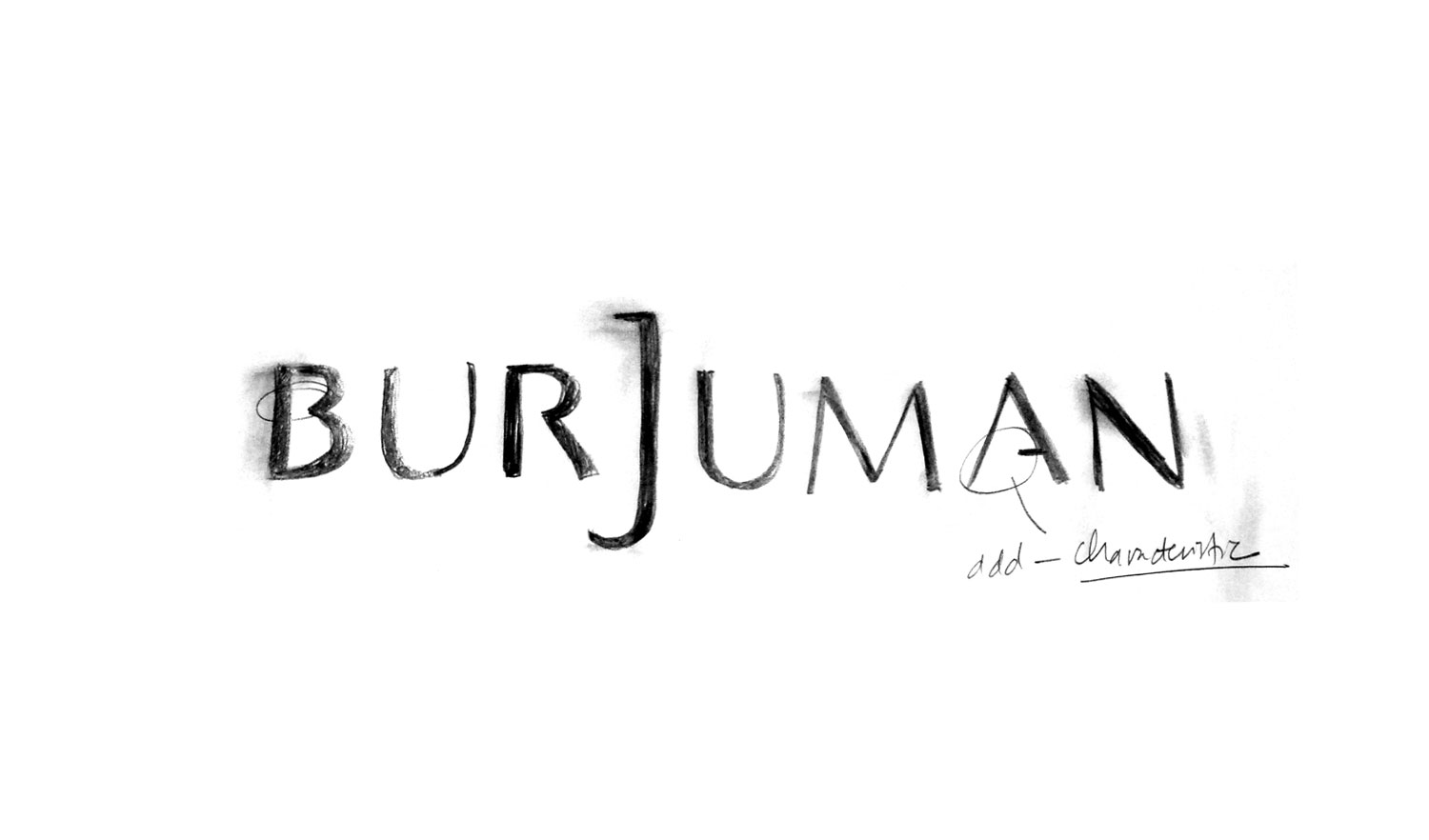
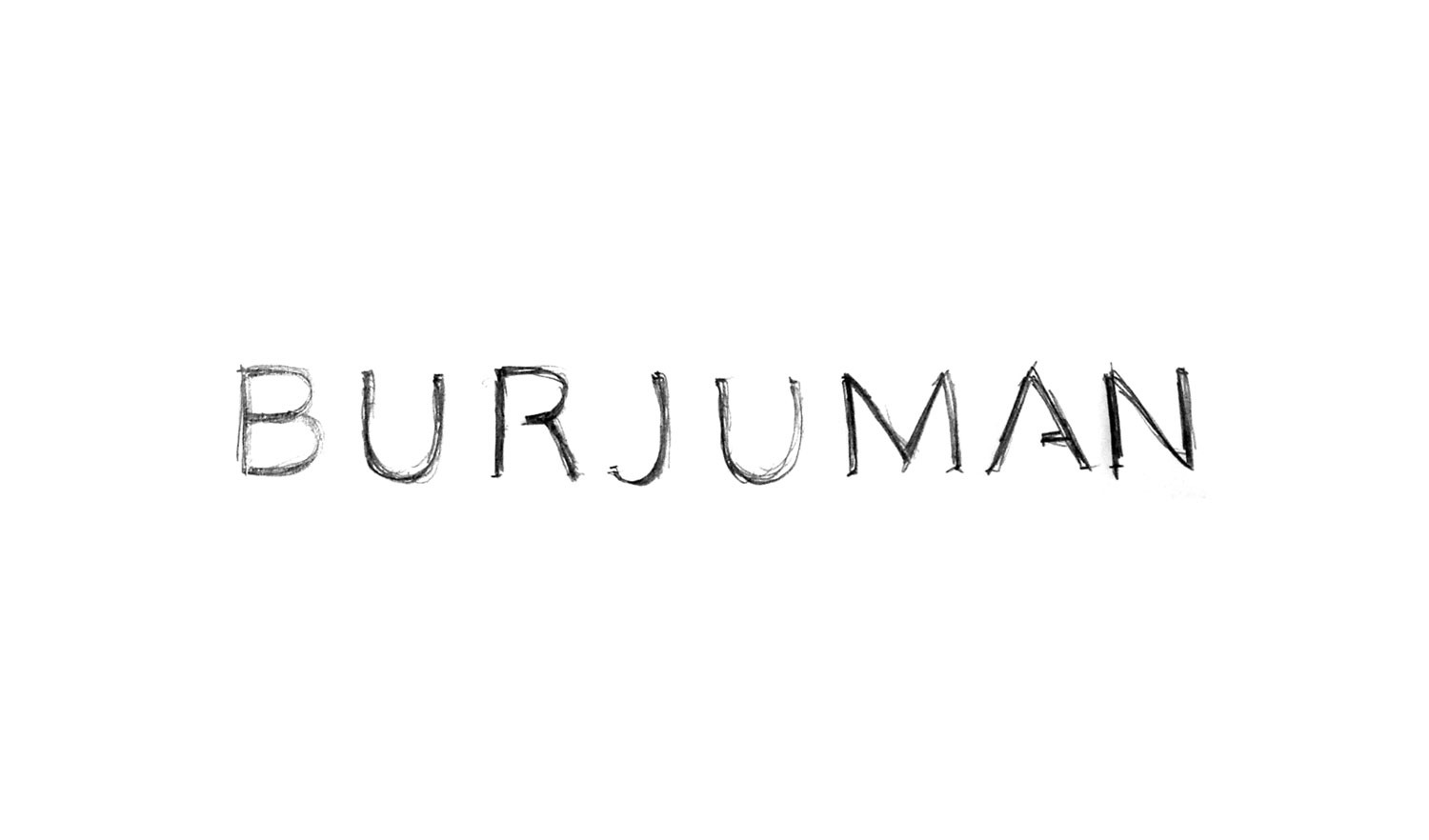
More than 60+ logotype studies were explored. Taking inspiration from famous logotypes by Gucci, Prada, Valentino and Louis Vuitton, I settled for something more clean and understated.
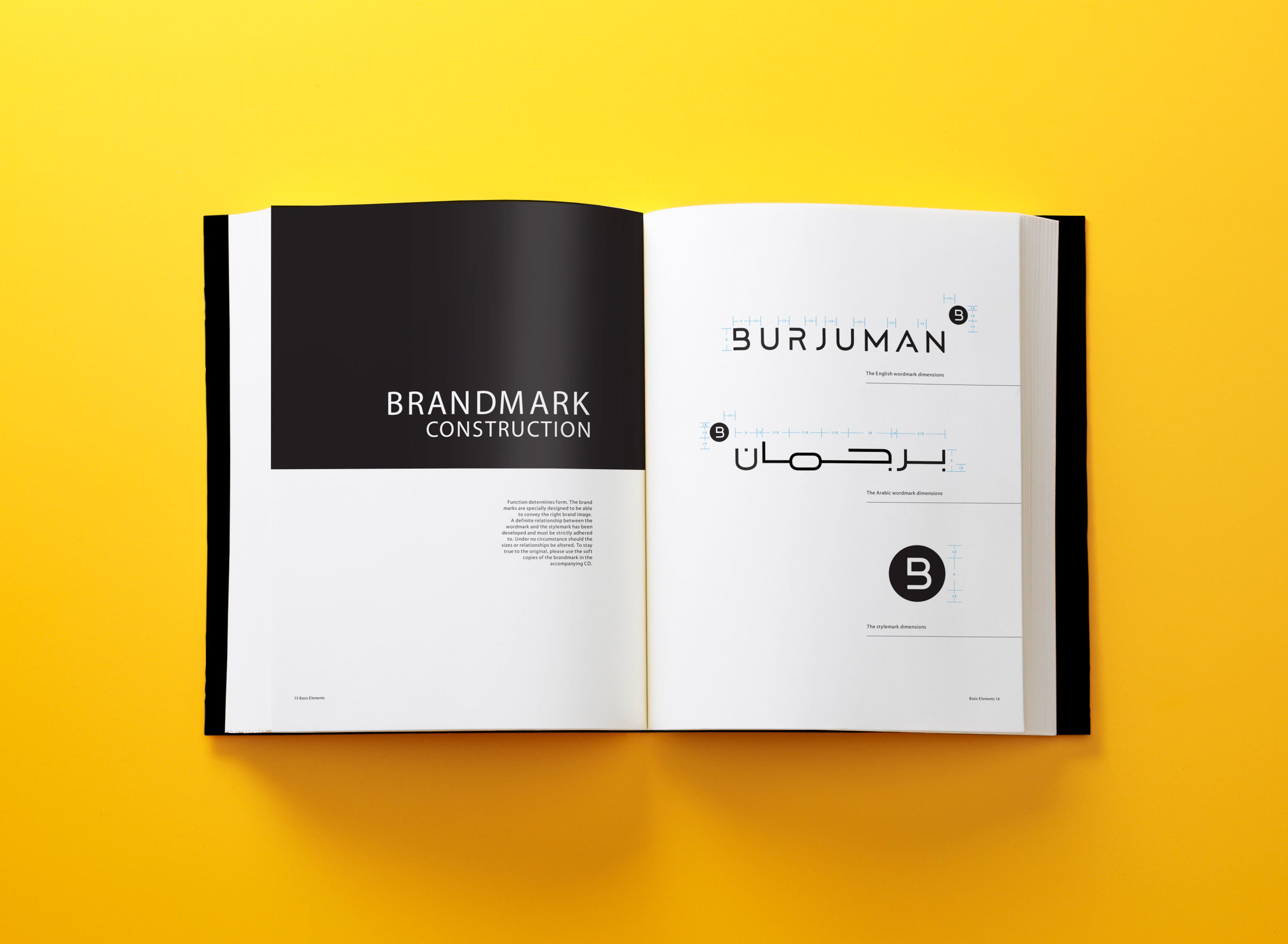
A ‘B-Mark’ emblem accompanied the rest of the identity. Used with or without the logotype, it serves as a brand seal, a reminder that BurJuman is the place where luxury brands reside.
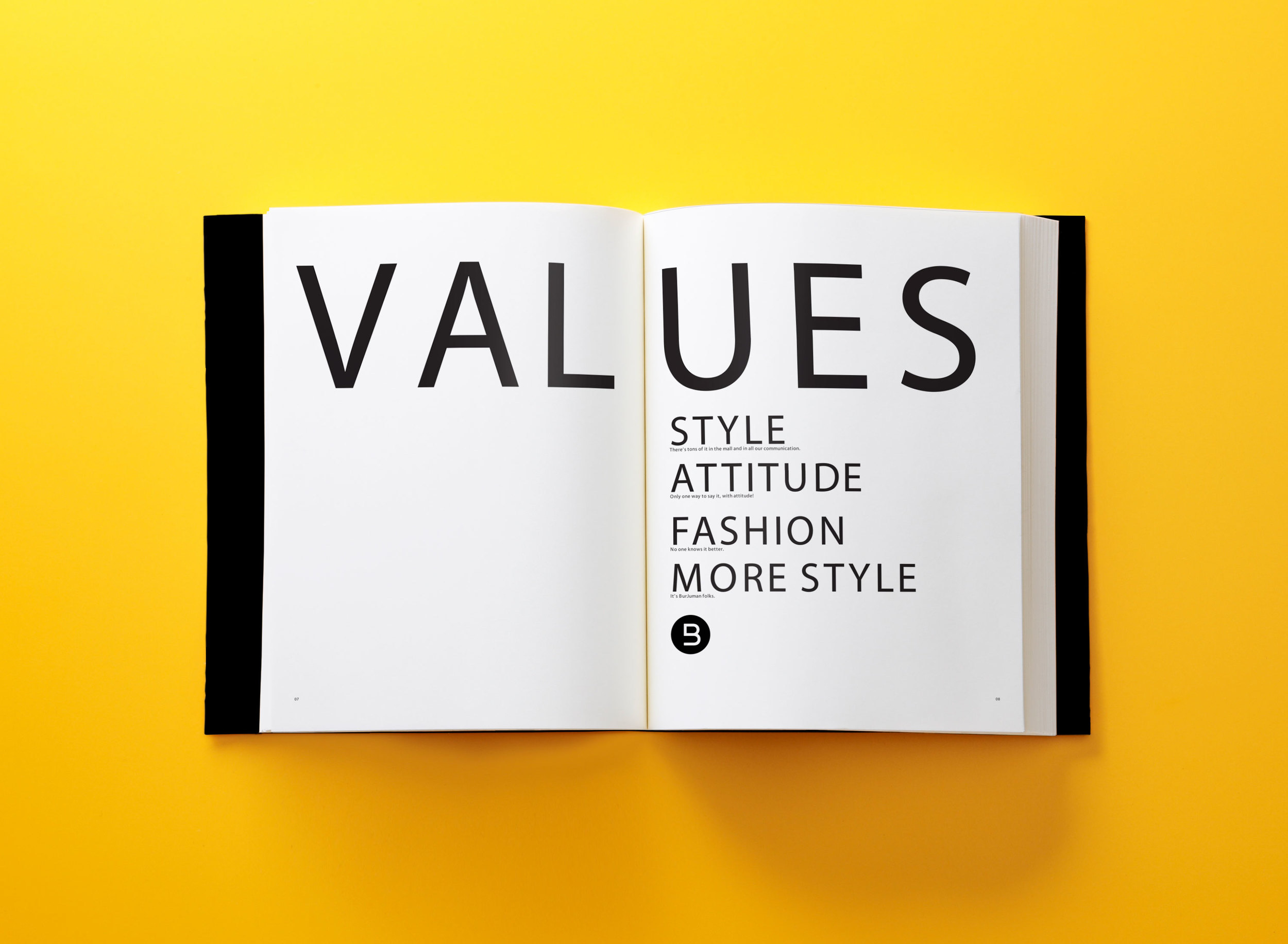
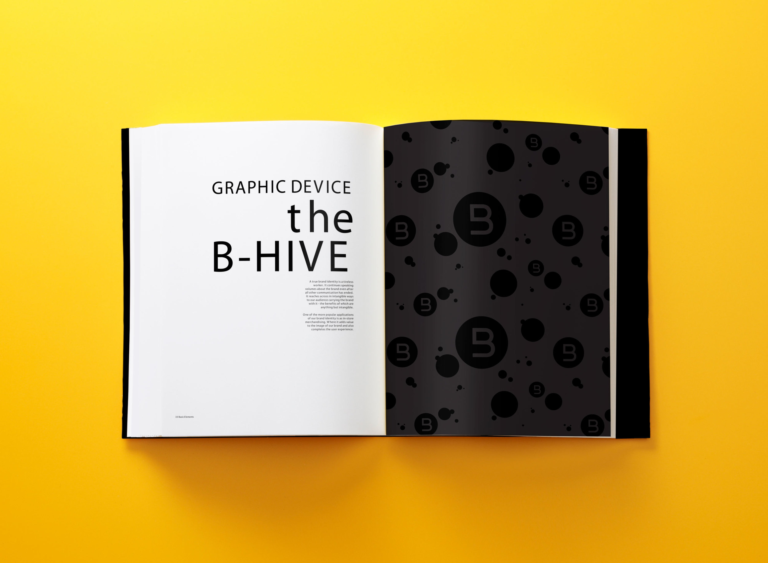
Along with the 'B-Mark', we crafted a unique Arabic logotype, custom Latin and Arabic fonts and the 'B-Hive' formed the rest of the 200page brand guideline book.
Entire range of collaterals were produced. Using the 'B-Mark', a wallpaper system was created. We called it the 'B-Hive'.
Gift wrapping papers used the 'B-Hive' system.
Positioning the New BurJuman as the luxury fashion destination, it was the first mall to have a dedicated concierge service. Shoppers can keep their shopping bags while they continue shopping even arange a limo service back to their hotels. Other new malls quickly followed suit.
Second phase - The 'NEW' Campaign
Repositioned as the new luxury fashion destination, the 'NEW' mall needed a complete rebranding exercise first. A new logo and whole set of visual identity were developed to help strengthen the new direction.
Once the identity was completed, a 'NEW' launch campaign was developed.
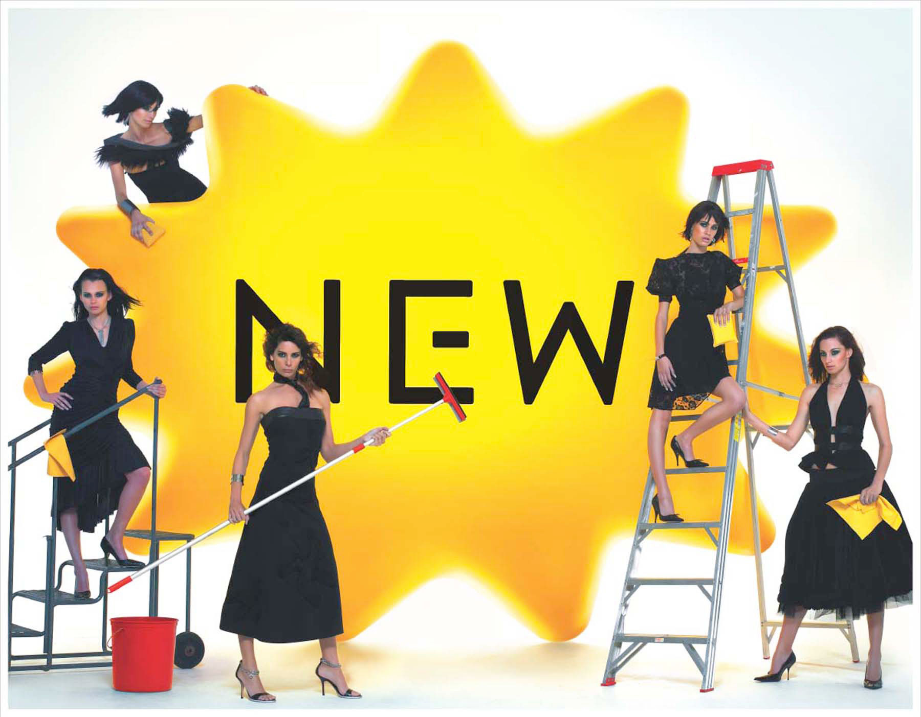
Using Kenny, a fully integrated campaign was launched. As with all things new, the choice of using the cliché starburst was deliberate.
Meet Kenny. Thousands of Kenny's were distributed in cinemas and universities in and around the UAE as cushions and stress balls.
The executions retained all the elements of style, attitude, humour and irony that are key to BurJuman. Symbolically, the executions also brought NEW to life signaling the launch of a brand new era in shopping.
For two weeks, Dubai woke up with a sea of 'NEW'. Kenny was on billboards, crashed parties and landed on cars and pavements. It even grew out of flower pots.
Across the UAE, giant Kenny’s came down from the sky.
Giant Kenny's 'fell' from the sky into Dubai's highly trafficked areas.
Just like flower bloom in spring, hundreds of Kenny's dotted the streets of Dubai.
Kenny was seen spotted all over the club scene. Various lifestyle magazines like Ok and Hello covered his appearances.
There were so much Kenny's seen around town that the police had to stop and ask what's going on.
Third phase - The Big Reveal
Just under two weeks, the UAE became yellow crazy.
We finally revealed who was behind the yellow fever by booking every billboard across the whole stretch of Shk. Zayed road (a major highway in Dubai), booked every newspaper in the UAE and on UAE's leading English newspaper (Gulf News), we created a media first - full advert buyouts. Every ad space during that day, including the ear panel, carried our campaign.
For the next two weeks, every outdoor during the entire 2 week launch period were booked. We literally painted the town ‘yellow’. Telling the people of the UAE that the all 'NEW' BurJuman has landed.
Overnight, all previously booked media channels got replaced with the 'NEW' reveal launch campaign.
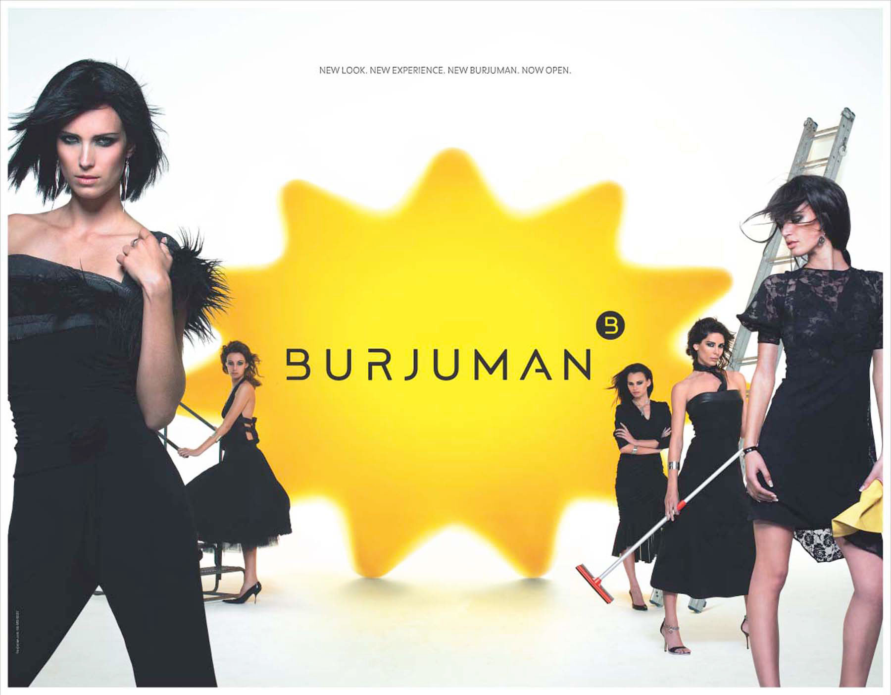
This full double page spread launch ad got release a week later followed by store listing announcement full page ads.
Results
Before the re-launch, weekly footfalls were just averaging 50,000 visitors. During our campaign and post that, the mall has seen a huge surge of visitors. Weekly footfalls were averaging between 200,000 to 250,000 visitors.
The integrated campaign bagged the MAXI Award by the International Council of Shopping Centres for its innovative approach to marketing.

