Biddi Everything.
A newbie in the online retail world, Biddi.com already has a lot of established competition in the market: Amazon.com and Ebay.com – just to name a few. So how do we make this new identity stand out from the rest?
Biddi.com needed to develop a unique identity, starting with a logo, all the way to their office and online store designs.
We started with the name ‘Biddi’, which in the local language (Arabic) means ‘I want’ – exactly what the target’s frame of mind is while surfing online.
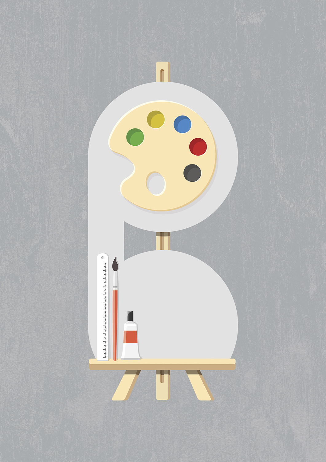
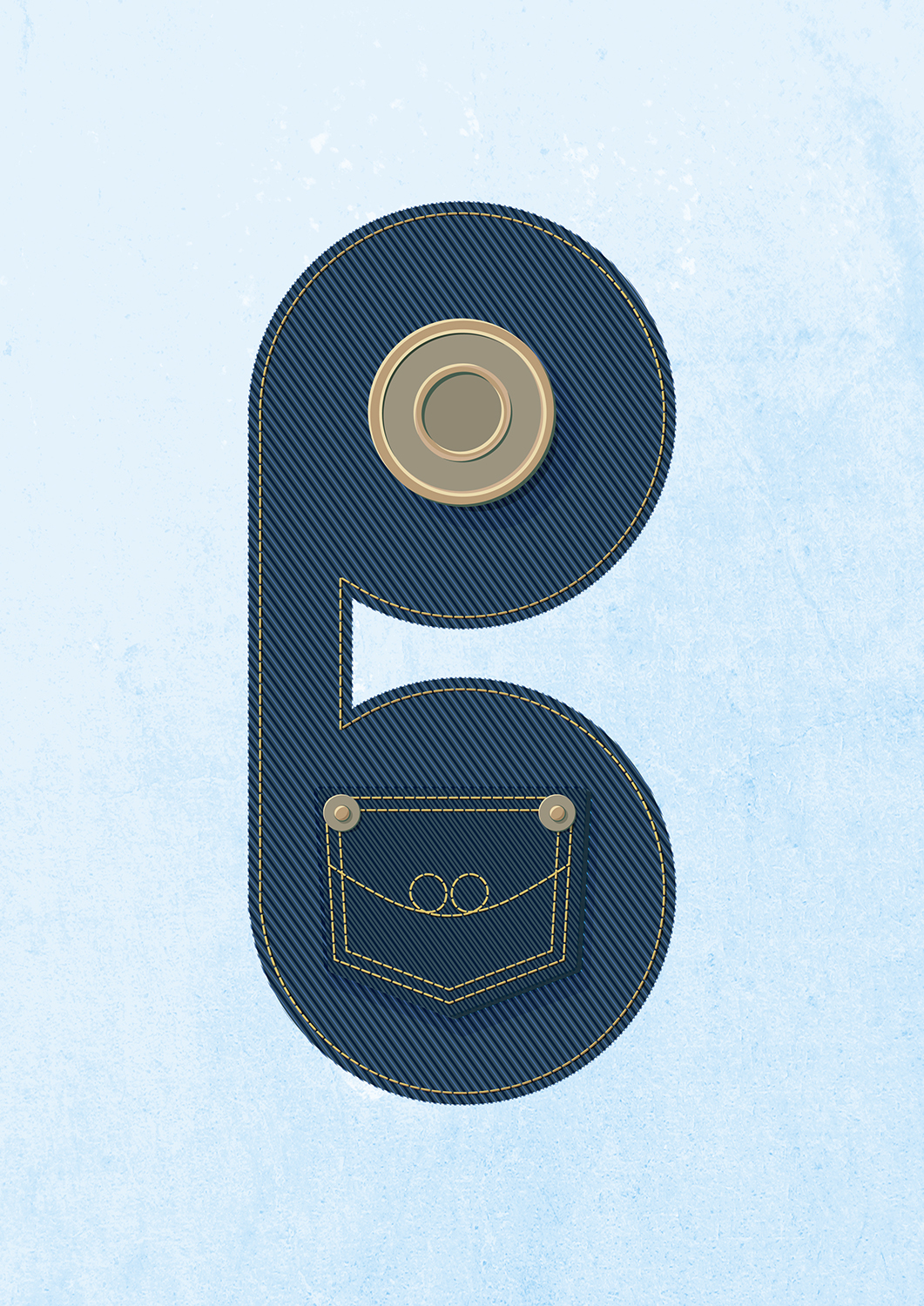
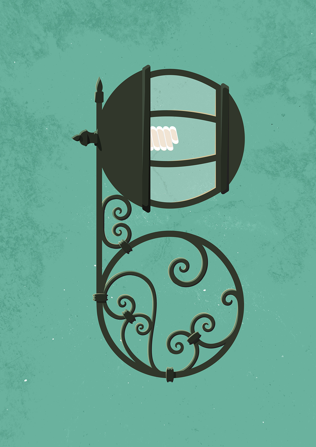
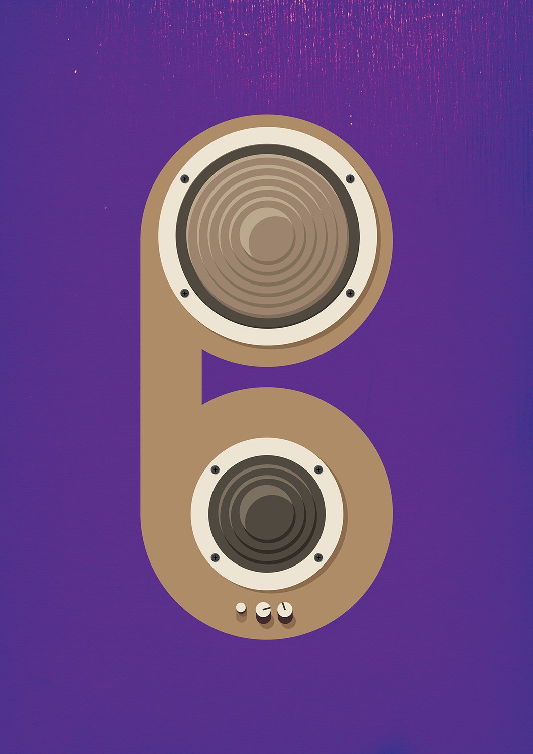
Another feature Biddi.com prides itself on is the fact that it’s an online store where you can buy or sell anything. Literally, anything under the sun can be found on Biddi.com, even a job. With hundreds of potential categories, we designed an identity system that could demonstrate the breadth of the store’s offerings.
Every time a new category was launched, illustrations of the logo were made to represent it. These eventually were the basis of all identity applications.
Multiple design versions were used so each staff will always have a different set of stationery when meeting new clients or sending out correspondence.
Biddi.com biggest feature is that it allows anyone who doesn’t have the means of selling their products or services online, to create their very own mini online store within the site.
Every time a Biddi.com sales employee goes out to meet potential clients, they carry a specially designed notebook that doubles as a company sales tool. When meeting hundreds of different types of retailers every day, the employee can customise the notebook to match the potential client’s business. Clients liked this personalised approach so much that they even requested for notebooks to keep.
The Biddi.com notebook doubles as a sales tool.
The Biddi office.
Various life sized objects made from illustrated logos peppered all over the office.
Being an e-commerce portal, tackling the UX and UI design strategy was an absolute integral part of the whole design process. The design DNA of being the “new hip kid on the block” was central to the UX and UI design approach.
Every bit of the design DNA was applied across all pages and devices.
Being able to display on multiple devices was at the core of the design DNA.


